Shipped Product Pages · UI/UX Case Study
TripIt
A shipped redesign of TripIt's signed-out product, pricing, and business travel pages.
Role
UI/UX design, page systems, responsive layouts
Type
Shipped product and pricing pages
Focus
Upgrade clarity, accessibility, localization, collaboration
Clarifying product pages, upgrade paths, and reusable patterns across TripIt's signed-out experience.
Project snapshot
Shipped page systems for TripIt's signed-out product experience.
Scope
Signed-out product, pricing, upgrade, and business travel pages across the public TripIt website.
Product/UI focus
Clearer page hierarchy, reusable layout patterns, upgrade visibility, responsive behavior, and navigation clarity.
My role
I designed page layouts, UI patterns, iconography, illustrations, and visual systems in collaboration with brand, marketing, product, engineering, and accessibility partners.
Recognition
Marketing Excellence Award
SAP Concur Best Practice recognition for the TripIt consumer website redesign and modernization effort.
The Challenge
Signed-out product experience
Over time, TripIt's signed-out product pages had started to drift apart. Navigation patterns, upgrade messaging, page layouts, and visual styles became inconsistent across the website.
The product decision was to treat the signed-out site as a connected system, not a set of one-off pages. That meant clarifying where each page fit, how users moved toward Free, Pro, or business travel paths, and which layout patterns could scale across future pages.
Before
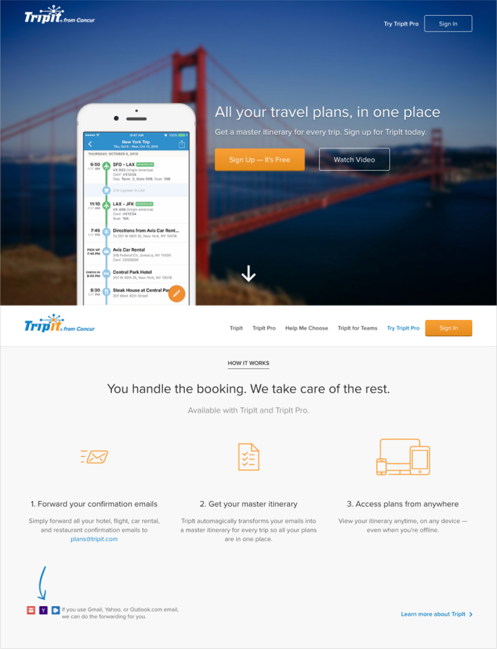
Fragmented page system
After
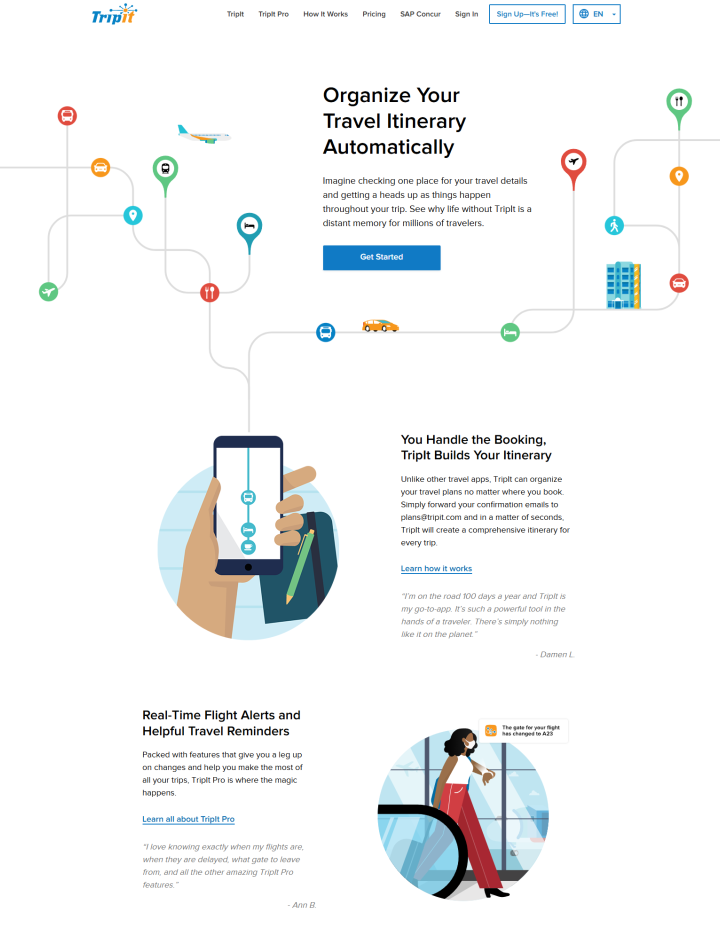
Unified page system
Additional old-system examples
Comparison page
TripIt Pro page
Teams page
Design Strategy
Goals and execution
Goals
Clarify the Product Story
Make TripIt's Free, Pro, pricing, and business travel pages easier to understand as one connected product experience.
Improve Conversion Clarity
Simplify upgrade paths and make Free, Pro, and Enterprise offerings easier to understand.
Execution
Create a More Consistent Experience
I used shared typography, page structure, illustrations, and UI patterns so users could move between product pages without relearning the experience.
Reuse Common Layouts
I chose reusable page patterns because the site needed to support future product, pricing, and campaign updates without creating more one-off layouts.
Make Upgrades Easier to Understand
Upgrade messaging and CTA placement were simplified so users could compare Free and Pro paths faster.
Improve Responsive Layouts
Dense sections were restructured because smaller screens, translated content, and accessibility requirements needed more resilient layouts.
Product Communication
Signed-out product pages
TripIt's product pages had become inconsistent over time. Messaging, layout structure, and upgrade prompts varied between Free, Pro, pricing, and onboarding flows, making the experience feel disconnected.
I focused on clearer page hierarchy, repeated CTA patterns, and more predictable navigation because users needed to understand Free, Pro, pricing, and business travel paths without piecing the product story together across separate pages.
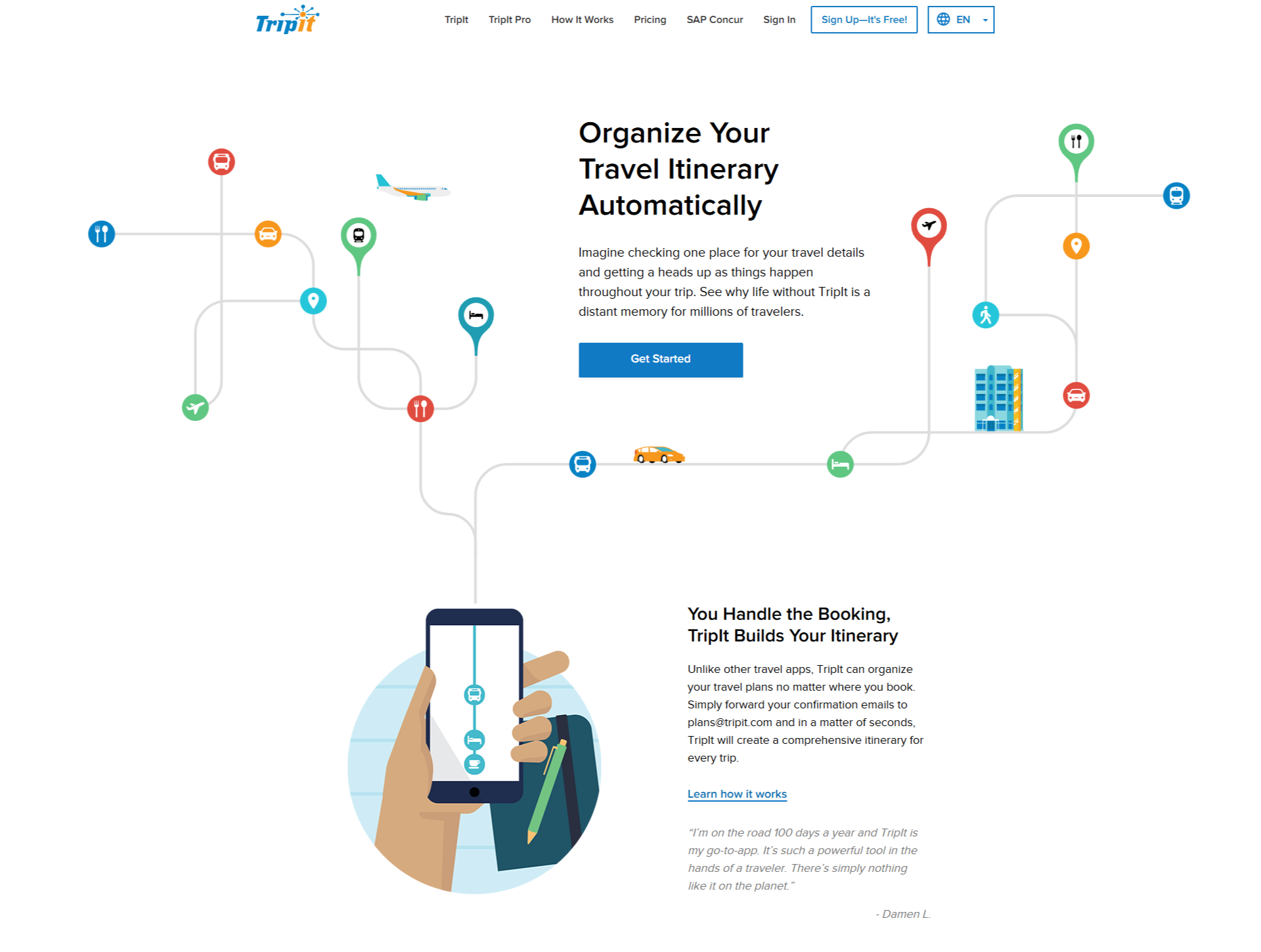
The free product page focused on quickly communicating core TripIt travel organization value.
Accessibility & Localization
Supporting a scalable page system
Older layouts were not always flexible enough for localization, longer translated content, keyboard interaction, or smaller screen sizes.
I simplified spacing, typography, and layout behavior because the system needed to hold up across responsive breakpoints, accessibility requirements, and international content variations.
WCAG AA Contrast
Updated color usage and UI hierarchy improved readability and supported accessibility contrast standards.
Keyboard Accessibility
Interactive elements and navigation patterns were reviewed to better support keyboard interaction and focus visibility.
Responsive Layouts
Signed-out pages were designed to scale more consistently across desktop, tablet, and smaller mobile screens.
Localization Support
Reusable layouts and scalable content structures helped support future localization and international content needs.
Enterprise Travel Pages
Business travel experience
Enterprise travel pages needed to explain business-focused workflows without feeling disconnected from the rest of the TripIt signed-out experience.
I kept the enterprise pages system-aligned while separating the messaging, because business audiences needed different conversion paths without feeling like they had entered a different product ecosystem.
Separated audience messaging
Business travel benefits were positioned separately from consumer-focused TripIt messaging while staying visually connected to the broader brand system.
Created clearer enterprise conversion paths
Page structure and CTAs guided business audiences toward SAP Concur-related travel workflows instead of relying on generic product messaging.
Kept enterprise pages system-aligned
Typography, illustration, spacing, navigation, and layout patterns stayed consistent with the redesigned signed-out page experience.
Visual System
Illustration, icons, and reusable UI assets
The redesign introduced reusable visual and UI patterns that helped keep TripIt's product pages, app promotion, enterprise content, icons, and illustrations aligned.
I contributed iconography, supporting illustrations, and page-level assets because the signed-out experience needed reusable visual elements that could support product explanation without creating more one-off page treatments.
Outcome
Result
The shipped redesign made TripIt's signed-out product, pricing, and enterprise pages easier to scan, easier to navigate, and more consistent across responsive layouts.
Clearer page structure
Product, pricing, and upgrade pages became easier to scan, easier to navigate, and more consistent from page to page.
Reusable visual system
Shared illustration, iconography, spacing, and layout patterns gave the signed-out site a stronger visual foundation.
Easier future page updates
Reusable page patterns helped reduce one-off layouts and made future product pages easier to extend.