Ambient Dashboard Concept · UI/UX Product Design
Coastal Home Dashboard
A planned 1024x768 wall-mounted dashboard concept for answering location-specific daily questions without feeling like another screen.
Role
Product concept, UI design, information hierarchy
Type
Ambient dashboard concept / planned build
Focus
Environmental UI, contextual data, restraint
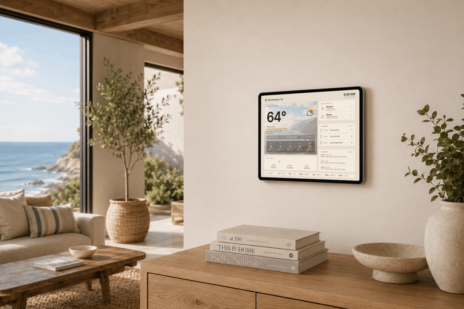
Project snapshot
A product/UI concept for making local daily information calm, glanceable, and useful in the room.
Concept status
A planned wall-mounted tablet build, not a shipped product. The case study focuses on product framing, UI structure, and visual system decisions.
Product problem
A coastal home depends on small daily signals like fog, wind, visibility, flights, and local sightings, but those details usually live across separate apps.
Design focus
I designed for glanceability, calm hierarchy, contextual data, environmental fit, and progressive detail instead of a dense control-panel experience.
Target Device
Viewing Distance
10 ft for at-a-glance weather
Interaction Model
Touch-based detail
Dimmed until motion
This was meant to live on a wall, not inside a browser tab.
Overview
Coastal Home Dashboard is a concept for a 1024x768 wall-mounted tablet interface designed for a coastal living space or hallway. The goal was to explore how daily information from several apps could become one calm, always-on view.
The location shaped the product. In the San Francisco, Daly City, and Pacifica area, fog and wind are everyday issues. Weather is not just a forecast here. It affects whether the ocean is visible, whether it feels comfortable outside, and what the day is likely to feel like.
I designed the dashboard around quick glances from about 10 feet away, more detailed reading from about 6 feet away, and touch interaction only when more context is needed. The default view stays quiet enough to live on a wall, while deeper information appears through expanded modules and focused modals.
Daily Use
Built for the small checks that happen all day.
Morning check
See fog, wind, calendar, headlines, markets, and sunrise context before starting the day.
Passing glance
Understand the weather and ocean visibility from across the room without picking up a phone.
Local moments
Notice nearby aircraft or log a whale sighting without opening a dedicated app.
The Problem
Context
I was designing around a daily behavior: checking several different apps just to understand what kind of day it is. Weather, fog, wind, calendar, flights, headlines, stocks, and local observations all live in separate places.
For a coastal home, the most useful questions are more specific than the temperature alone. Is it foggy? When will it clear? Will the wind calm down? Can we see the ocean? When is sunset? Are there whales nearby? What aircraft are passing overhead?
I chose a restrained ambient dashboard because the screen would live in the room, not just in a browser tab. It needed to be useful in passing, readable from a distance, and detailed only when the information was worth attention.
Constraints
It had to work from across the room.
1024x768 tablet display
Large type, simple grouping, and card-based hierarchy for a fixed tablet canvas.
Viewed from 6 to 10 feet away
Detailed information needs to work from about 6 feet, while weather and key status should be clear from about 10 feet.
Always-on wall display
The screen should stay useful throughout the day, with a dimmed idle state that can wake or brighten with motion.
Coastal fog and wind
Fog, wind, visibility, and clear-up timing are treated as primary information, not secondary weather details.
Frequent nearby aircraft
Aircraft are shown when they are close enough to be audible or visible, instead of alerting for every passing flight.
Warm wall color
The visual system is tuned around Shoji White SW 7042 so the display feels connected to the room rather than floating on the wall.
Design Goals
Useful without feeling like another screen.
Glanceable
Prioritize information that can be understood quickly from across the room.
Calm
Use soft contrast, warm surfaces, and restrained alerts so the UI fits the home.
Built around local context
Treat fog, wind, visibility, sunset, whales, and aircraft as core product context.
Progressive
Keep the default view simple, then reveal detail only when useful.
Key Design Decisions
The hardest part was deciding what not to show.
Weather became the anchor
I gave fog, wind, visibility, and sunset timing the clearest hierarchy because they affect the daily routine more than generic weather data.
One page replaces several apps
I grouped weather, calendar, markets, news, flight tracking, and notes because the value is in reducing small repeated checks.
The default state stays calm
I avoided dense charts and loud alerts because the screen is always visible and should not make the room feel busy.
Detail is optional
I kept the passive view simple because touch interactions should be reserved for moments when someone wants more context.
Flights need filtering
I filtered nearby aircraft because constant local activity would turn useful context into noise.
The visual design had to hold back
I used restraint because the UI needed hierarchy and polish while still blending into the wall.
Final Dashboard
A daily glance built around coastal context.
The default dashboard puts weather and time-sensitive local context first, with calendar, headlines, markets, and sun timing grouped into secondary cards.
I kept markets and headlines as secondary context because they are useful daily checks, but not important enough to compete with weather and local conditions.
The goal was not to show everything. It was to make the most useful information visible without turning the wall display into a dense control panel.
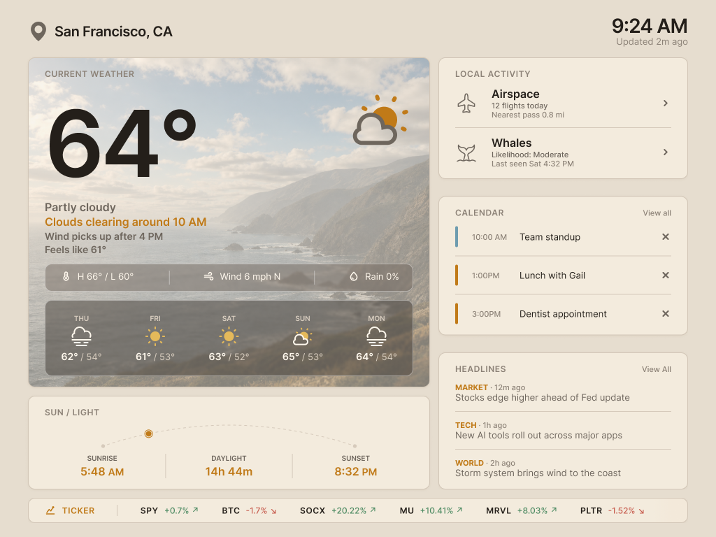
Weather designed for visibility, not just temperature.
Coastal Weather
The weather module answers the practical questions that matter in a coastal home: whether the ocean view is visible, when fog may clear, and when the wind may calm down.
Instead of forcing the user to interpret hourly data, the dashboard translates conditions into practical daily context through short readable summaries, large type, and a consistent coastal visual system.
Day and night modes support the room.
Adaptive Interface
Because the dashboard is wall-mounted, night mode needed to feel significantly darker, not simply recolored. The goal was to reduce brightness and glare while preserving the same information hierarchy.
The sun and light module also changes meaning at night, shifting from daylight progress to time until sunrise. This makes the mode functional, not cosmetic.
Weather System
One coastal scene, fourteen weather states.
The dashboard uses the same coastal composition across seven weather conditions in day and night modes. The scene changes with the weather, but the visual system stays consistent enough to feel like the same home environment.
day - Clear

day - Clear
Local Activity
Nearby flights and whale sightings make the dashboard feel specific to the home.
This is not a separate local activity page. It is a way to group two things that are specific to this location: aircraft passing near the house and whale sightings from the ocean view.
Flights use tracking data and only react when an aircraft is close enough to be audible or visible. Whale sightings are manually logged, creating a personal record of what was actually seen from the space.
Flights
Aircraft stay quiet by default, then trigger a subtle approaching state when a nearby pass is relevant.
Whales
Sightings are logged manually as personal observations from the home.
Local context
The dashboard reflects what matters around the house instead of acting like a generic smart display.
Interaction Flow
Flight details appear only when they matter.
Because the home is near a flight path, passing aircraft are common. The dashboard avoids treating every plane as an alert.
The Local Activity card stays passive by default, then shifts into an approaching-flight state when an aircraft is nearby and likely to be seen or heard. From there, the user can open a focused modal with route, closest pass, direction, altitude, speed, and status.
Whale sightings become a lightweight personal log.
Tracking Patterns
The whale tracker started as a simple way to log sightings from the home. It is manually logged on purpose, because the value is personal: what was seen, when it happened, and what conditions surrounded it.
Over time, the log can help reveal patterns like common viewing windows, seasonal changes, weather conditions, and the best times to watch. A future version could also support learning to identify whale types from repeated sightings.
Designed to blend with the wall
Visual Direction
The palette was based on the surrounding wall color, Sherwin-Williams Shoji White SW 7042. The goal was not to match the wall exactly, but to stay close enough that the tablet felt connected to the room. Warm neutrals, soft beige surfaces, and low-contrast cards help the dashboard sit back instead of floating like a bright rectangle on the wall.
Since the dashboard is wall-mounted, the interface needed to feel more like part of the room than a traditional app. The design avoids stark white surfaces, heavy contrast, and bright saturated colors except when an alert or meaningful state change needs attention.
The weather artwork follows the same principle. Each condition uses a consistent coastal landscape so the display changes with the weather without feeling visually random or disconnected from the home.
The hardest design choice was making it quieter.
Tradeoff
A lot of portfolio work tries to look impressive immediately. This project pushed in the opposite direction. Because the dashboard is meant to stay visible in a living space, the interface could not rely on loud color, heavy contrast, or decorative UI just to prove it was designed.
That was the main tradeoff: it still needed hierarchy, polish, and personality, but those qualities had to come through restraint. I used scale, spacing, subtle contrast, warm surfaces, and contextual imagery instead of making the screen compete with the room.
The goal was for the dashboard to feel considered when someone looked closely, but quiet enough to ignore when they were just moving through the space.
What I intentionally left out
Scope Control
Because this display is always visible, I avoided features that would make it feel like a command center. I deprioritized dense charts, inbox-style feeds, heavy notification systems, complex controls, and data that was interesting but not useful in the room.
The dashboard only escalates information when it becomes locally or personally relevant. That restraint was important: the concept works best if it is useful at a glance, but easy to ignore.
Design Result
Concept result
The final concept turns a wall-mounted tablet into a quiet daily layer for the home. It brings together the information I would normally check across multiple apps, while keeping coastal weather and local conditions at the center.
Instead of acting like a traditional productivity dashboard, the product behaves more like a household object: useful from a distance, calm when ignored, and detailed only when someone wants to engage with it.
Built around local context
Designed around coastal visibility, wind, fog, sunset, nearby aircraft, and whale activity.
Glanceable
Information is grouped by priority so the screen can be understood quickly from a distance.
Ambient
Day and night modes help the dashboard blend into the room instead of demanding attention.
Next steps
Planned Build
The next step is to build a functional prototype using live weather data, calendar integration, flight tracking, AI-generated headline summaries, market context, and manual whale sighting logs.
I would also test the dashboard on an actual 1024x768 tablet in the intended room to evaluate viewing distance, brightness, night-mode glare, and whether the information hierarchy still works passively on a wall.